Mobile Ready Images For Amazon: The Need Of The Hour
Brands spend hundreds of dollars to get that perfect shot of the product. However, while most product packaging shots look almost-flawless on desktop, they don’t quite work well when viewed on mobile devices. Customers want to shop quickly and purchase the product right from the digital shelf, without having to zoom in and read the text or view the images. On a small screen, normal product packaging shots look fiddly, the information is hard to see and the shopper experience turns out to be poor.
Moreover, there is always the risk of shoppers mistakenly adding the wrong product in the cart. It is believed that shoppers multitask when they are ordering products online from mobile. As a result, they pay less attention to what they are buying. This often leads to accidental adding of products in the cart followed by returns or negative reviews. Therefore, it is essential that brands focus on creating product images adapted for small screens or mobile-ready hero images.
Big Brands Are Already Using Mobile Ready Hero Images; Its High Time Other Brands Start Use It Too
As the customers are quickly switching from desktop to mobile, Mobile Ready Hero Image, the product images that have been optimized to look great on mobile, has become a buzz word in the online grocery world. Currently, more than 100 name brand owners and retailers, including Unilever, Tesco, P&G, Carrefour and Asda, have created a workgroup with global standards body GS1 to define guidelines and rules for mobile-ready hero images.
What Is Mobile Ready Hero Image?
Mobile Ready Hero Images makes it easy for shoppers to identify critical product information like brand, product type, flavor and size, just by glancing at the main image. This eliminates the need to open the product detail page and read the rest of the description. These images were specially created to speed up grocery shopping on mobile devices. However, they work great for almost all types of products.
First Step To Creating Mobile Ready Hero Images: Understanding The 4Ws:
Using just the photo of the physical item is not enough; it never is. As shoppers pay more attention to visual content, your main product image/hero image clearly should showcase the vital information they need to make a purchase. They should be able to purchase decisions, just by seeing the main image. To make sure all the relevant product information is covered in the image, it is necessary that you answer the “4Ws” as decided by the GS1 and Cambridge University but with our Beauty Spin on it.
The “4Ws” of Beauty
- Who is the brand?
In the uber-competitive marketplace like Amazon, brand is what can help the customers differentiate your product from that of cheap, 3P sellers. Your brand name should be clearly indicated in the product.
- What is it?
Is it pet food, shampoo, soft drink, toy, etc. For many products, this feature can be conveyed visually and not by text. E.g., there is no need to write ‘water’ if you are selling a bottle of water because that’s self-explanatory.
- HoW do I use it?
Features that can distinguish your product from other products by specifically explaining how to use it with specific instructions
- HoW Much Of It Is There?
The amount of product or the net weight should be prominently visible on the main image. E.g., 60 tablets, number of diapers in a package, 750ml of shampoo, etc.
In some cases, the 4Ws can be modified to make sure the information presented in the image is relevant enough. For some products, the Which variety is it might include the target age range, e.g., suitable for 0-12 months. Likewise, How can cover dimensions or overall length of the toilet roll and so on.
Don’t Rely On Product Titles To Convey The 4Ws
Now you might say that the customers can get the 4Ws from the title as well, why optimize the images then? Humans are visually-wired creatures, so they will naturally view the images first and not the keyword-packed titles. Moreover, the length of Amazon titles is 200, so it can be challenging for the customers to locate the 4Ws at a glance. This is why it is advisable not to rely on the titles to communicate crucial product information to the customers. The key here is to give the shoppers 4Ws right in the hero image.
Basically, there are two options available for elaborating information and integrating your branding elements in the images. Depending on the type of product, you can either highlight the information On-Pack or Off Pack.
Digital Pack/On-Pack Optimization – Enhancing The 4Ws In The Packaging Itself
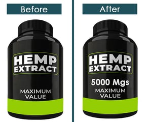
Digital packaging means the digital representation and re-creation of the physical packaging that may differ from the physical package yet retain the majority of key elements of design, shape, color and aesthetics. Unlike most conventional product packaging photos, it is not created by clicking in the photo studio and then cropping the background. It is digitally created and made to look extremely professional and high quality as it does not contain any common photography flaws like lighting issues, creases, etc. In on pack/digital pack optimization, the packaging is digitally modified so that it can include and communicate the 4Ws effectively. This is a sophisticated method for product image optimization.

Best Practices:
- The packaging can be modified, but it should not be completely different. The shape, size, color and aesthetics of the packaging should correspond to the physical packaging.
- If the brand name, product name, or the important elements are too small or blur, they can be made legible.
- Some of the unimportant and unnoticed elements can be removed to make more efficient use of space.
- Elements that answer any of the 4Ws should be highlighted.
Off Pack Optimization – Placing Info Next To Product Packaging
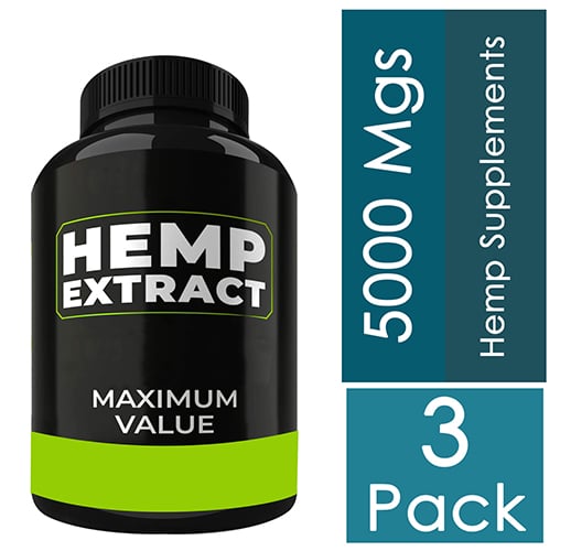
Sometimes or rather, most of the time, it is not possible to include all the relevant information into the packaging because it can ruin the visual appeal of the image and make it look clumsy or unprofessional. This problem majorly occurs with products that have very flat or thin packaging. In such a situation, you can highlight the 4Ws off-pack, on the image canvas. Here, the graphic elements are placed next to the product packaging.


Comments